
Increasing usability & accessibility of complex weather apps
Problem
Apps designed for water and outdoor sports users need to be more feature rich than everyday weather apps, but this comes at a cost to usability and accessibility.
This excludes many potential users from life saving data and leads to app switching in core users.
Solution
For this MVP project I prioritised creating space to increase text sizing and reduce noise by providing a highly customisable experience.
In the Splashboard web app Users can build dashboards, customise them, compare weather models and learn how weather is measured within 2 clicks.
Case study read time: 3 minutes
My role: End to end process including research, user testing, design iteration and prototyping
Duration: 3 months
Platform: Responsive web app (mobile and desktop focus)
Success criteria: WCAG 2.2 AA, concept approval from target users
Outcomes: Passsed accessibility audit and gained 100% concept appeal in user testing
RESEARCH & DISCOVERY
Scoping an ambiguous brief
The starting brief was to solve usability problems in complex weather apps used by water and outdoor sports enthusiasts. I used competitor analysis to uncover what potential usability pain points users might be having. As a baseline contrast I also looked highly developed simple weather apps like Apple and Pixel Weather.
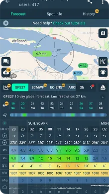
Windy.app
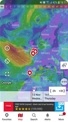
Windy.com
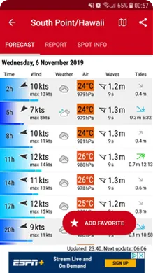
Windfinder.com
Pixel Weather app
Through competitor analysis, I identified:
Three key usability barriers
1. Cognitive load: Dense layouts could intimidate casual users and slow decision making overall
2. Optimisation: Data presentation was either fixed or only partially customisable
3. Accessibility: Tiny text, transparencies and colour-only coding excludes many and adds noise
One solution to solve three problems
Dashboard: Combining user built dashboards of modules (like on Pixel Weather) with a time controller (found on weather maps like Windy.com) would allow:
1. full customisation: users can add and rearrange what they need and remove what they don't
2. increased space and data presentation to aid accessible design and speed up decision making
3. simpler overview of changes through micro animations within modules as uses change time shown
Proving hypothesis - user interviews
I interviewed six outdoor enthusiasts (windsurfers, hikers, sea swimmers, cyclists) and used affinity mapping to synthesise their feedback into actionable patterns. three themes emerged:
No personalisation → clutter slows decision making
Auto animations and colours → sense of overwhelm
App switching → fragmented planning
User centering my designs
I distilled insights from all six interviews into two personas representing distinct user needs and pain points that will form the basis of my designs.

Ari Riviera
Weekend Water Warrior
About: 42, Hamburg, Senior Accountant, Married with kids.
Goal: I want to quickly compare conditions across local spots using my experitise to filter the data I need and view trusted weather models side-by-side to understand the probability of the forecasted info.
Frustrations: I constantly switch between multiple apps, overwhelmed by irrelevant data and difficulty reading some visuals due to colourblindness.

Naomi Simms
Risk-Conscious Outdoors Enthusiast
About: 26, Queenstown, Teacher.
Goals: I want to check multiple locations across several days with clear risk indicators e.g. water level without having to remember data across three different websites.
Frustrations: I don't always understand what I'm seeing, I find rapid map animations and data overload disorienting due to a recent concussian and fixed datasets don’t match my complex trekking planning needs.
PREPARING TO DESIGN
Simplifying complexity through OOUX
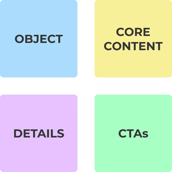
Weather apps contain dozens of interconnected data points (forecast data, weather models, locations, time ranges). To avoid creating another cluttered interface, I used Object-Oriented UX (OOUX) to map out core objects, their attributes and relationships.
Outcome: A clear content model that informed my information architecture.
Atomic design system approach

To iterate quickly while maintaining consistency, I built a scalable design system using Atomic Design principles in Figma. This included:
* Text and colour styles applied systematically
* Assets library (icons, buttons, patterns)
* Component library (buttons, modules, time slider)
Impact: Made iteration cycles quick and seamless.
Addressing accessibility from the start

Considerations:
* 14 pt minimum text size with larger values for critical data
* 4.5:1 text contrast ratio minimum, 3:1 non text contrast
* Semantic colour system reinforced with icons or numbers
* Audio summary with transcript for flexible on-the-go planning
* Simplified language and helpful explainers for complex weather concepts
These weren't added at the end — they shaped every design decision from wireframes forward.
DESIGN ITERATIONS
Scoping the design process
Throughout the iteration process I used a cycle of design > prototype > user testing > improve.
The complexity of issues in weather map design is a problem worthy of its own project. With this in mind I excluded the maps section from my designs to decrease project scope for better focus and time management.
User testing & stakeholder feedback
I conducted three rounds of moderated and unmoderated usability testing with 18 participants total, iterating between each round to address critical issues.
My highly expereinced UX design mentor acted as key stakeholder throughout the project and provide feedback on research, designs, testing and overall process.
Below are key iteration phases for two main ares of the app: Home Screen and an example Dashboard.
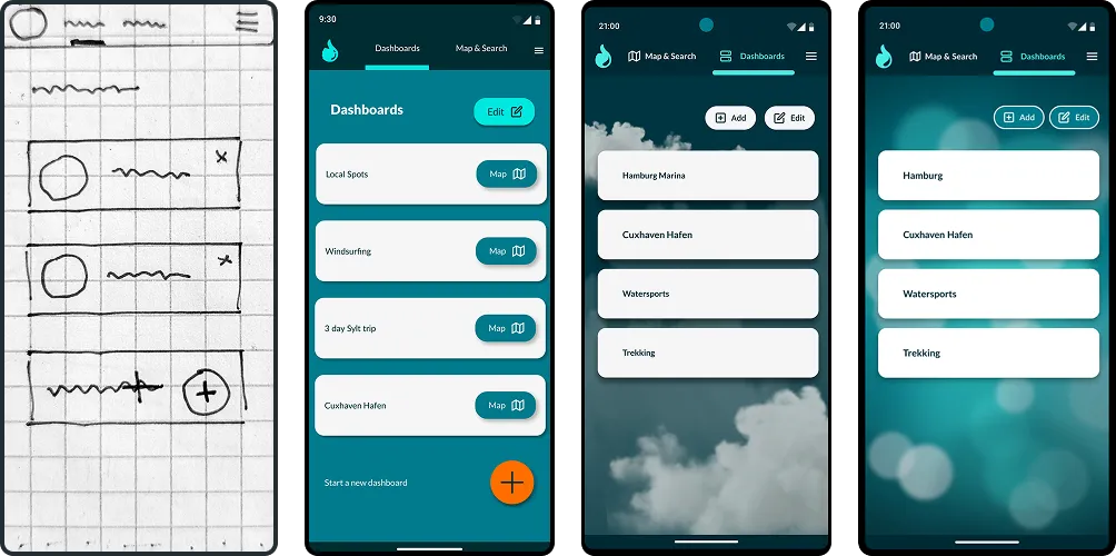
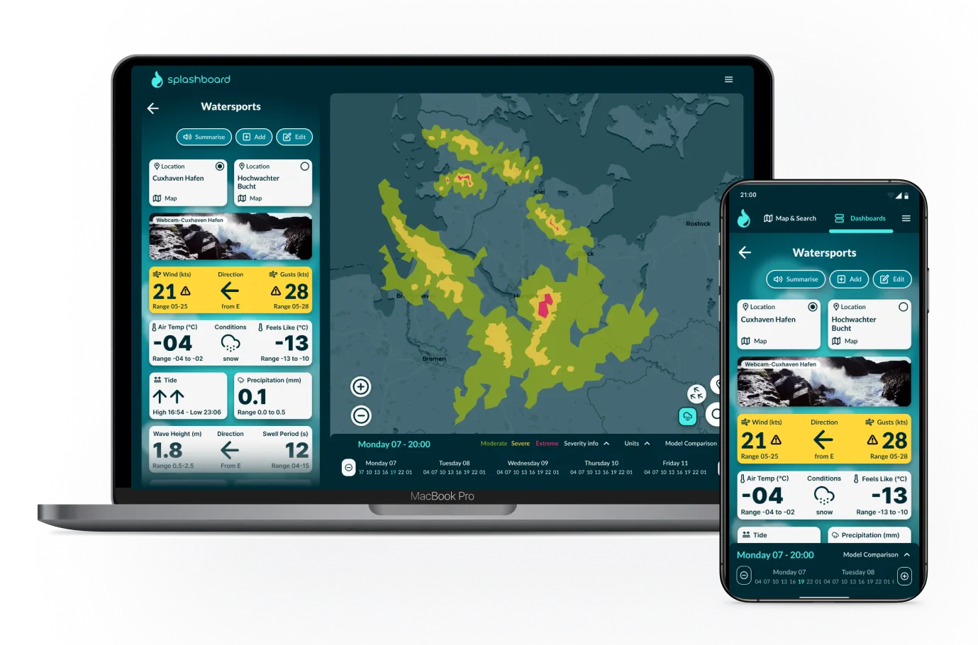
Home screen
Create your own set of customisable forecast dashboards for a location, activity or trip. Or head straight to a forecast map.
Top menu content: Map & Search, Dashboards, Menu
Dashboard card actions: Add, Remove, Reorder or click for more detail and explainers
What I learned from user feedback:
* Decide on semantic weather warning colours before CTA button colours to reduce confusion
* Long swipe gestures are too challenging for some users and conflic with mental models
* Clear, findable action buttons reduce the need for tooltips
* Balance themed backgrounds with noise reduction through abstract illustration
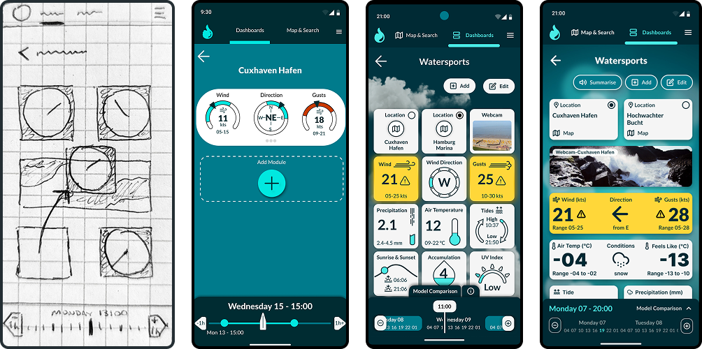
Dashboards
Choose from a set of weather data modules to build your ideal forecast dashboard for a location, activity or trip. Adjust the time controller to view changes statically rather than scrolling through long lists of data.
Data modules: Add, remove, rearrange from a wide range of data sets
Severity warning: Shows moderate/high risk interactively through only 2 colours supported by icons
Time controller: Observe changes +/- 3 hours each click or quickly swipe through whole days
What I learned from user feedback:
* Variety in the design of data modules prevents confusion from sameness but KEEP IT SIMPLE!
* Innovation works best within established mental models, don't innovate too extrmely
* Outlines in graphics can increase unecessary noise
* Don't neglegt earlier design ideas when direction hits a dead end
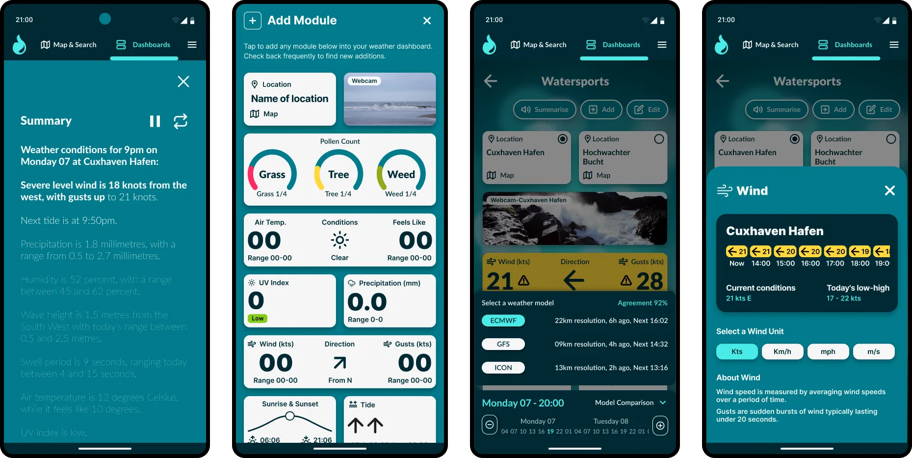
Below are additional screen views of Weather Summary, Add Module, Weather Model Comparison, Wind Info Card.
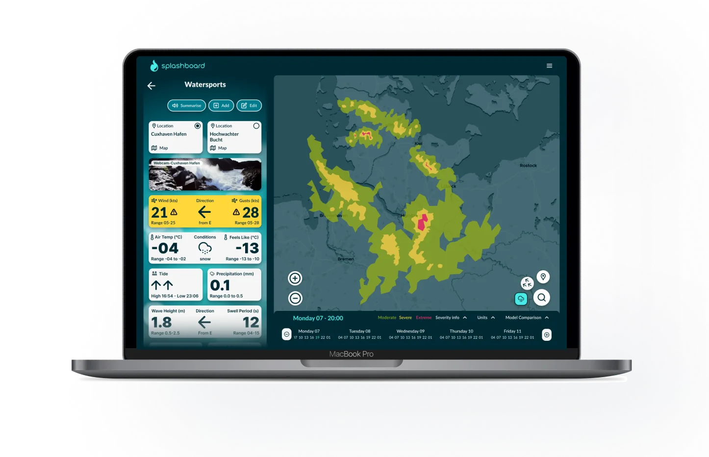
Splashboard on desktops
Splashboard is fully responsive and designed mobile-first to prioritise clarity and focus. On desktop, the experience stays consistent — but makes use of the larger screen, providing all users' chosen data in one screen rather then two sections.
Test the prototype
I have coded a prototype using AI for you to experience the a Splashboard weather dashboard for yourself. Give it a try:
OUTCOME & NEXT STEPS
What worked
* I confirmed target user interest user interviews and user testing
* Accesibility auditing the coded prototype shows ....
* OOUX provided a strong foundation for complex information architecture
* Iterative testing caught major usability issues early
* Building a design system early helped iterate a complex design quickly
What didn't
* I could have run a user workshop with new questions that arose after initial designs
* At first I tried to design a full app including maps, but this was too much scope for a short project
* Module design could have been much quicker by starting simpler then adding complexity later
What next?
If it were to be developed and released as an MVP I would:
* run time on task tests compared with two other apps
* Compile and analyse app feedback to improve module design and add user requested modules
* Add community feedback integration to help users guage accuracy of specific weather stations/buoys