
A German grammar app for lower intermediate learners
Teaching essential grammar and vocab through interactive story games
The Challenge:
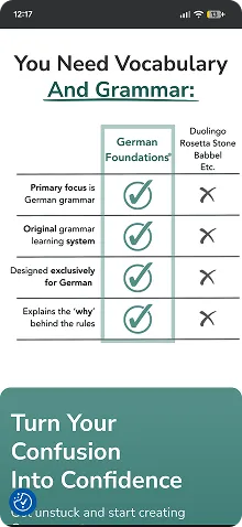
Duolingo is great for beginners to learn basic German vocab and sentence structure, but it doesn't teach you enough grammar to start forming your own sentences. I set out to design an engaging app that helps pick up where Duolingo leaves off - and be way less pushy.
My Role: Solo designer within a UX course project | Duration: 1 month | Platform: Native app Android/ios
My Approach: A time efficient Agile approach by taking user research to form the design brief and moving directly into iterative rapid prototyping via AI assisted coding an interactive game followed by user testing.
Want more details?
I know you only have a little time so I made this case study as simple as possible. Email me an online call invite to discuss more details
Researching user needs
User centering my designs
I interviewed three German learners and distilled all insights into one persona representing the most common user needs and pain points that will form the basis of my design.
Susan Walters
Pushing her way towards B1 15 mins a day
About: "I'm 35, from US now living in Köln. I commute one hour by train to work at an International Start-Up. My partner and I have two attention-hungry kids.
Goals: “I aim to achieve German B1 level asap and then just try to keep it”
“I don’t get much time but I can sustainably do about 15 mins study per day"
Frustrations: "I speak English at home and at work so I get little chance to learn German in context."
"After work I want to spend my free time with my family."
Susan's user stories

As a non-native living in Germany, I want to learn essential German quickly so that I can feel comfortable interacting in daily life as soon as possible.
As a busy professional with childcare responsibilities, I want a short bite-sized learning format on my phone so that I can grab study moments like on the train to work.
As a frequent Duolingo user I don't feel like I'm progressing, I want an app that's equally engaging but really teaches me how to use German.
Her problem in a nutshell

Susan needs a way to get to B1 level in German as soon as possible because she needs to feel settled in Germany while managing her daily chores. We will know this to be true when we see that she can actively remember the top 1000 frequently used words in German, and typically apply gender in the right grammatical case in common sentences.
Conceptualising the problem
Finding inspiration
I investigated a range of learning resources like the vocab app Reword, the website germanwithlaura.com championing grammar learning, Der Die Das rules book and my interviewee's favourite Duolingo.
Duolingo lesson
Reword vocab list
Learn With Laura
Der Die Das rules book
As an English language teacher of eight years and a current German learner I leaned in on my experience to form a list of key findings to help draw from the best parts and avoid the worst
What's working
* Short lessons delivered one step at a time
* Progress overview: Vocab bank and lesson levels
* Gamification: tracking stats, points, streaks etc.
* Clean UI, but also colourful and cheerful
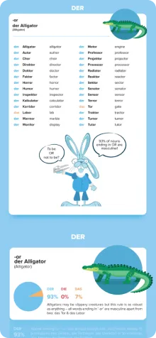
* Grammar shortcuts: noun gender traits, declensions table and case triggers
* Short stories
* Colour coding genders
* Free to use taster
What's not
* Uninspiring copywriting and content
* Overly pushy notifications and guilt tripping
* Pay walls preventing you from finishing a lesson
* Too many features and settings
* Lack of goals
* Unusual, unatural speech examples
* Lack of language in context
Design hypothesis

I believe that by creating a mobile app that clearly demonstrates the fundamentals of how essential German sentences are built in context I will achieve a go-to resource with clear goals and milestones that empower Susan to recognise and apply the German language in daily life.
How → why
* Learn and practice in context through stories → Learning through narratives is very human, engaging and flexible. Stories can be tales, articles, dialogues etc. and can be read, listened to and read out loud for solid practice.
* Extract vocab and grammar from each story → Further contextualised learning to aid understanding and memorisation.
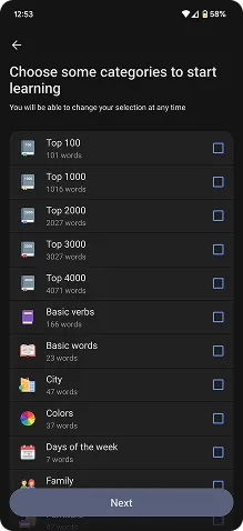
* Focus on top 1500 words used in German → Helps keep daily German the priority.
* Probability over accuracy → Provide shortcuts and condense grammar tables to reduce overwhelm for learners. At this stage it's about applying rules rather than mastering them.
* Use colour coding and consistent UI structures → Aid memorisation, increase learnability and reduce overwhelm
Learning points

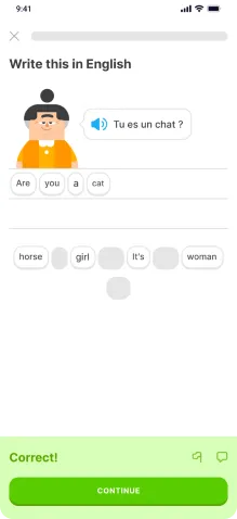
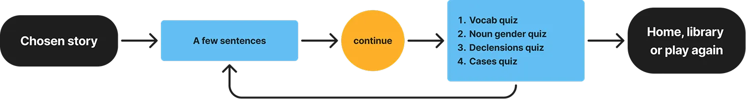
For the first test story lesson, I wanted to focus on a few of the classic paintpoints with learning German like gender, cases and declensions. Other stories will be written to include and test other essential grammar points like prepositions (with verbs, movement, location etc) and key triggers that change case or word order.
Designing the solution
First round of prototyping and testing
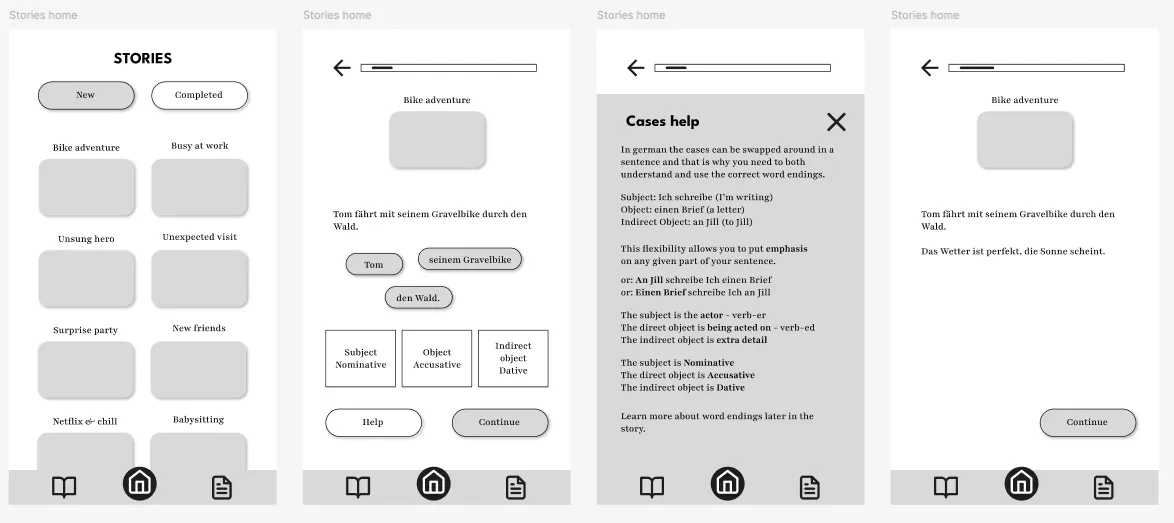
I sketched some wireframes for a story user flow and then tested it with five participants using both in-person and remote testing.
Test insights → Next steps
* Testers loved the idea of learning through stories and the user flow was already familiar from Duolingo stories → continue developing this concept.
* They all appreciated the help section, but 4/5 didn't click it at first because 'help' was confusing → change to 'hint' or provide the info upfront.
* All testers liked the vocab section, but a lack of interaction in the prototype overall made testing unintuitive → create a fully interactive story prototype
End of the project... or was it?
This is where the short UX project left off, with a low fidelity prototype that users couldn't properly test. Several projects later I decided to apply new rapid prototyping skills to finish off the concept.
Vibe coding

To build a working prototype ready for user testing that could load the different stages with interactive games, hover states, progress tracking, score stats and more, I turned to LLMs like ChatGPT.
It was an intuitive, iterative process that easily allowed me to track the code being produced and make my own edits to the HTML and CSS code to save time during each iteration.
Grounded iteratation
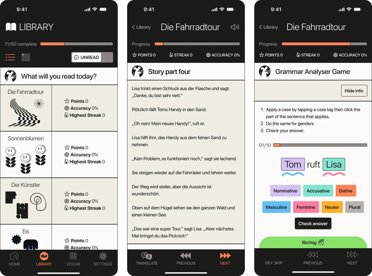
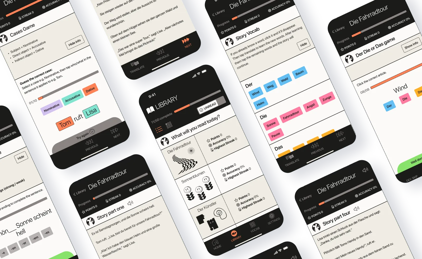
v2 High Fidelity Design
For version 2, I designed high-fidelity screens on Figma and used them to prototype the full story user flow using Figma Make with the following changes:
* Sticky menus top and bottom for consistent navigation
* Translate button for story segments for easy referencing
* Improved hierarchy and typecale for a consistent experience
* Fun Brutalist style for a clean, accessible interface with character
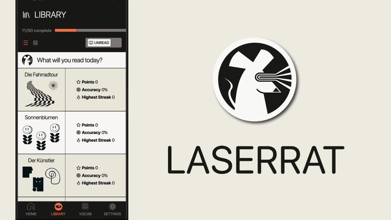
* New name and logo: Laserrat, derived from Leseratte (Bookworm)
* Read out loud feature for story segments for listening skills / pronunciation
The overall structure, story and games remain the same and were user tested in the next round.
Voices from user testing
I did user testing of the v2 prototype with three new German learners in the A2-B1 level range to learn the following:
* Is it intuitive to play?
* Did participants learn anything?
* How can it be improved?
Learned new vocab and grammar → valid approach
“I learnt some good rules for applying male, female and neutral in part 2.”
“Overall I consider it’s a good app to learn.”
Getting stuck and misclicks → unclear instructions
“I don’t know if I was supposed to click on each word once or just on one word.”
“I struggled with the last section so much in terms of controlling the buttons and knowing what to do.”
No sounds → less emotional reaction
“Add sound so the user can listen to the words.”
Minor UI inconsistencies → edit in the code not with AI
“I'm not sure if they are grey on purpose.”
"Make it clearer if options chosen are right or wrong."
v3 Responding to user feedback
User testing revealed a range of issues in the design. I addressed the critical errors first using AI prompting on Figma Make and then made minor tweaks inside the code:
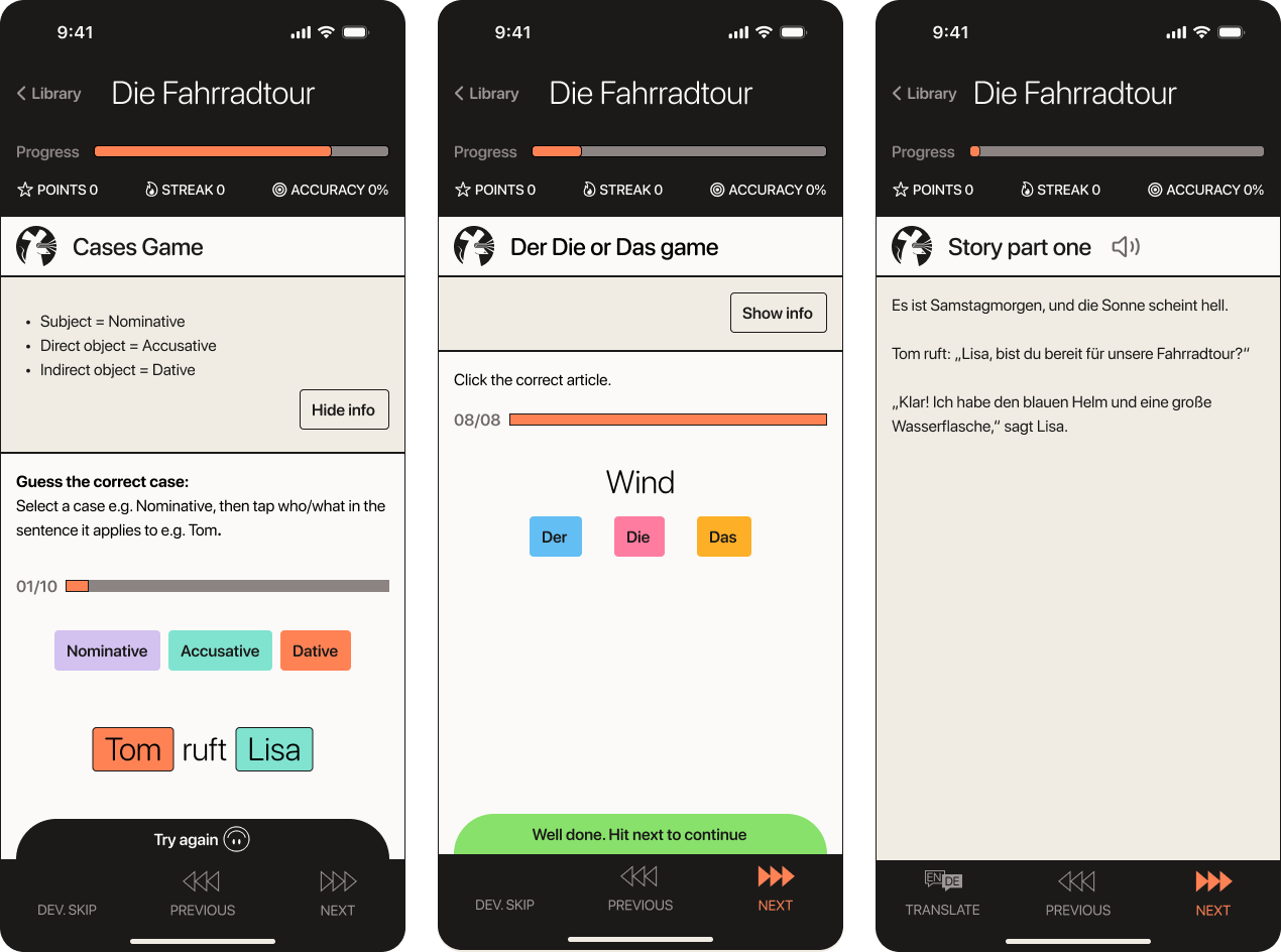
* Changed game order so cases are introduced before declensions
* Simplified the cases game to focus on just cases
* Added a basic API to allow a read aloud button in story sections
* Added correct, try again and game complete sound affects for fun
* Edited game instructions and grammar help sections for clarity
Using Figma Make
Overall using Figma Make for prototyping is a very mixed experience. I like the transition between Figma, but it is not aware enough to create a consistent UI and makes frequent errors.
