
A redesign of the Göttingen public library website
Making an important community service responsive, modern and accessible
The Challenge:
The city library's website fails WCAG 2.1 AA standards (legally required under BITV 2.0 and EU Web Accessibility Directive), has poor usability on mobile and more digital uptake could help an understaffed team.
My Role: Solo designer within a UX course project | Duration: 2 months | Platform: Responsive web
My Approach: Agile UX within tight constraints — leveraging existing user feedback, heuristic analysis, and rapid iteration over extensive primary research.
Original site (opens in a new window): https://stadtbibliothek.goettingen.de/
Understanding the background
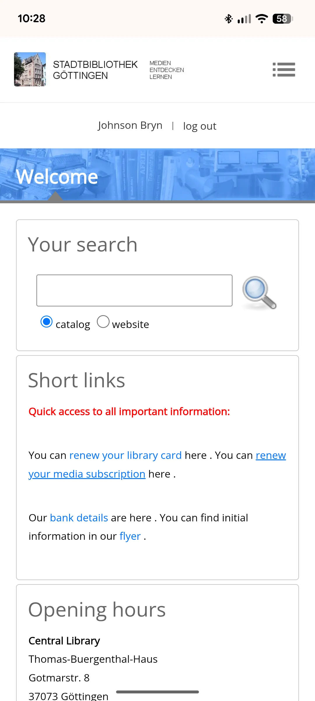
The current website
Stadtbibliothek.goettingen.de is the website for my city's public library. The library itself is pretty good with 3 floors and a huge kids area. However the website needs an update to improve digital services uptake and accessibility.
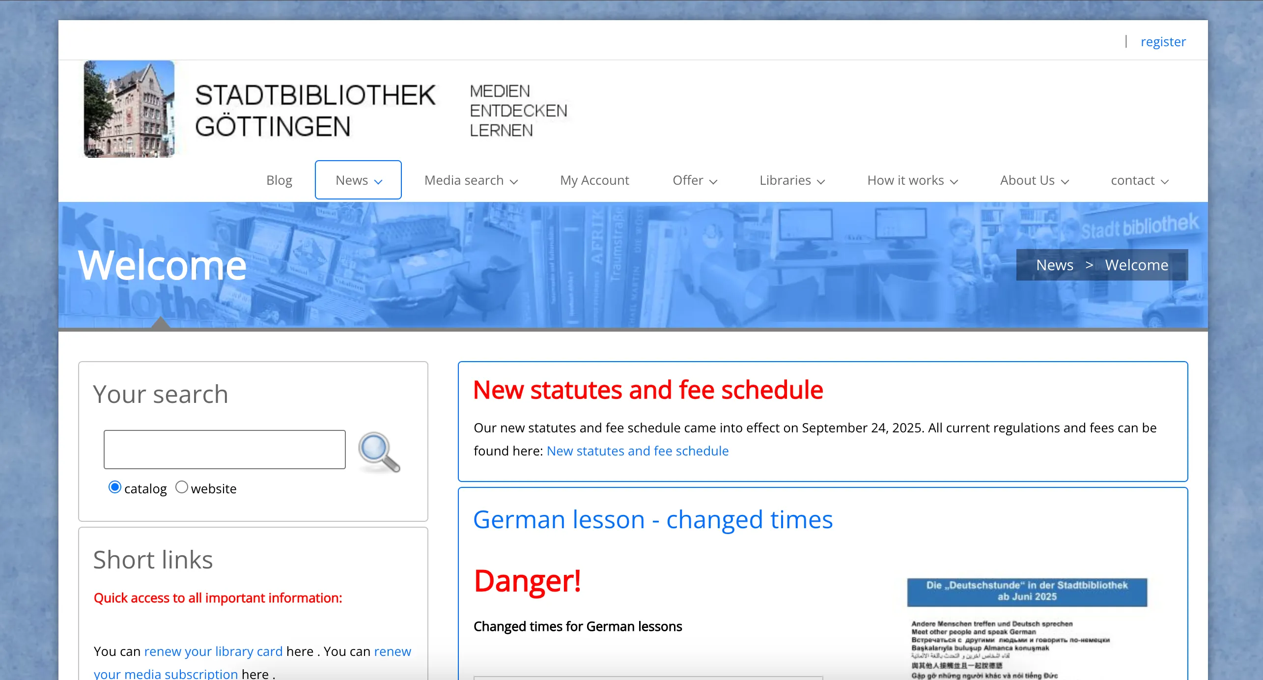
Site audit
The audit focused on assessing the usability and accessibility for typical user tasks such as browsing the homepage, searching for/reserving books and renewing loans.
Hard to navigate and self-serve online
Key findings → impact
* Images: Mixed formats and small poster text → cluttered, inconsistent look.
* Structure: Menu and content order feel random → navigation confusion.
* Key content: Dense text and unclear CTAs → reduced clarity and inclusivity.
* Responsive layout: Mobile view often breaks → hard to read or scan.
* Language: No other languages or easy read options → less inclusive.
* Accessibility: Does not meet WCAG 2.1 AA standards in text size, touch targets, colour contrast, etc.
Reviews: Rated 4.4★ on Google. Most complaints concern limited opening hours, staff shortages, and unhelpful service.
Insight: Improving and promoting digital self-service tools would ease staff workload and give users faster, more accessible ways to manage loans and reservations.
Competitor analysis
I analysed several leading library websites to identify modern usability patterns.
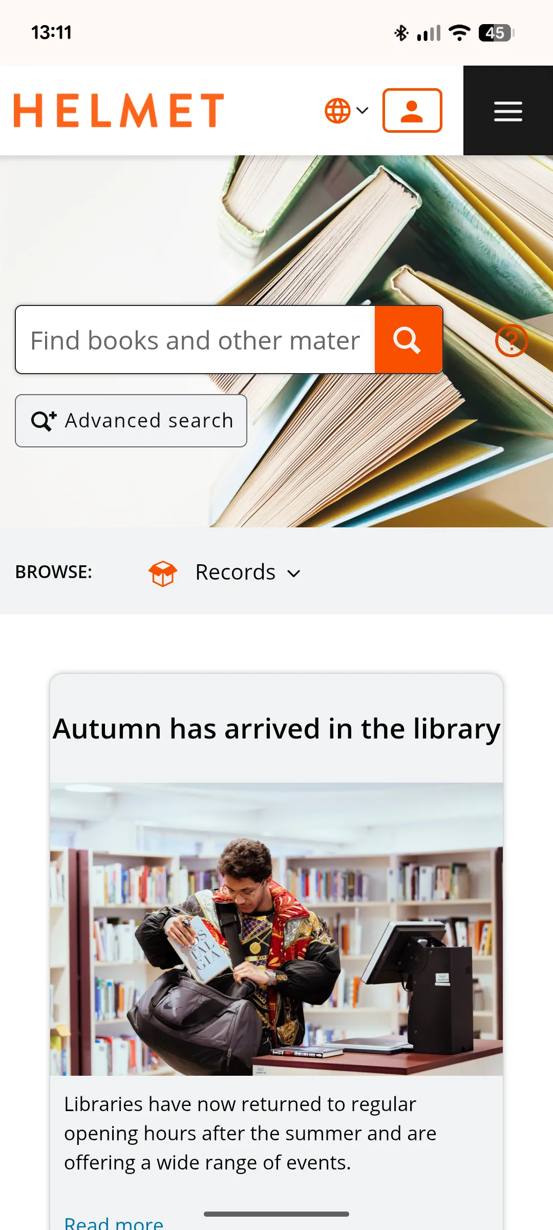
Helmet Homepage
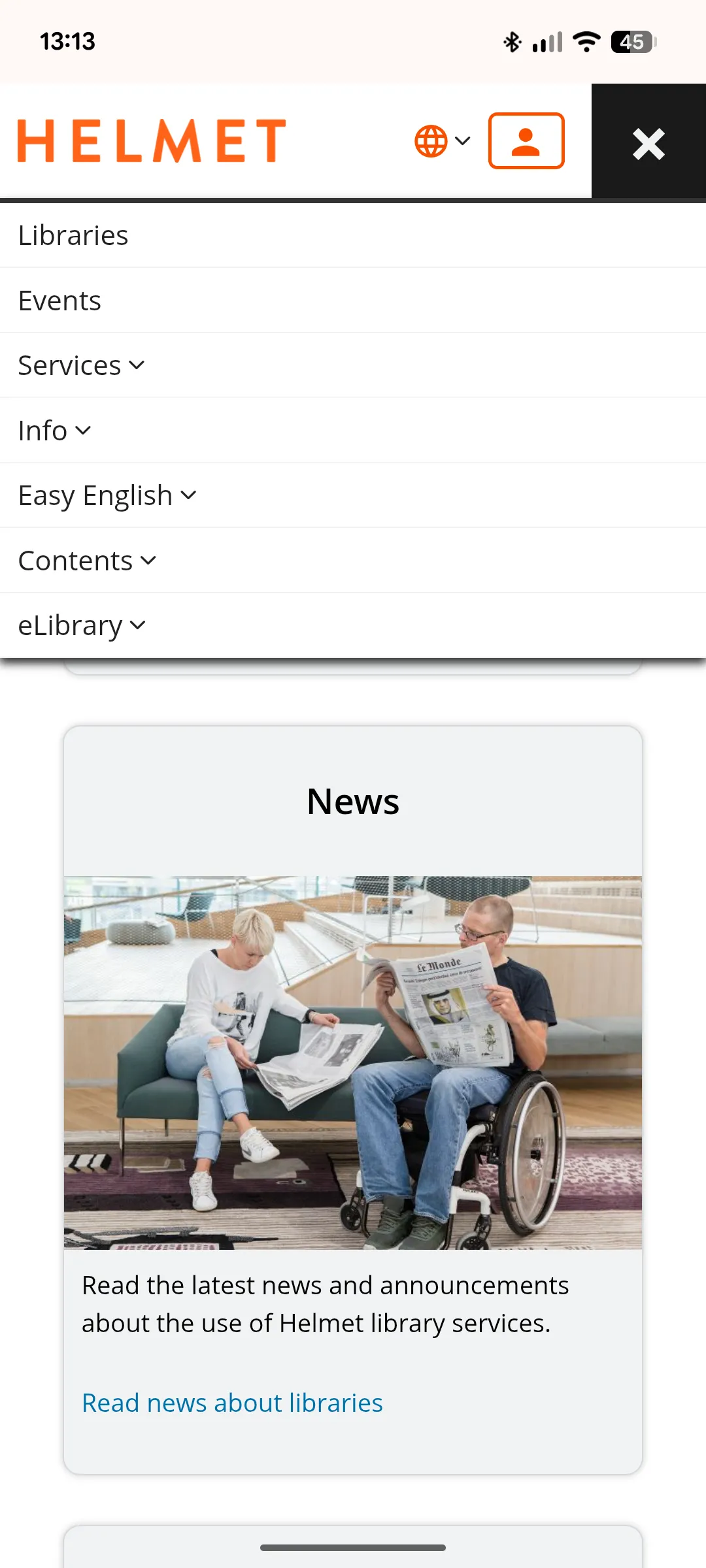
Helmet Menu
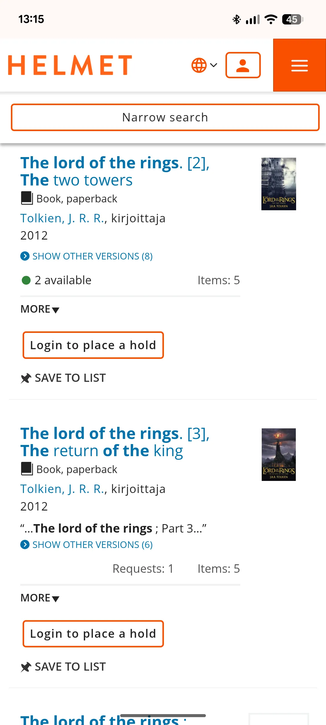
Helmet Search Results
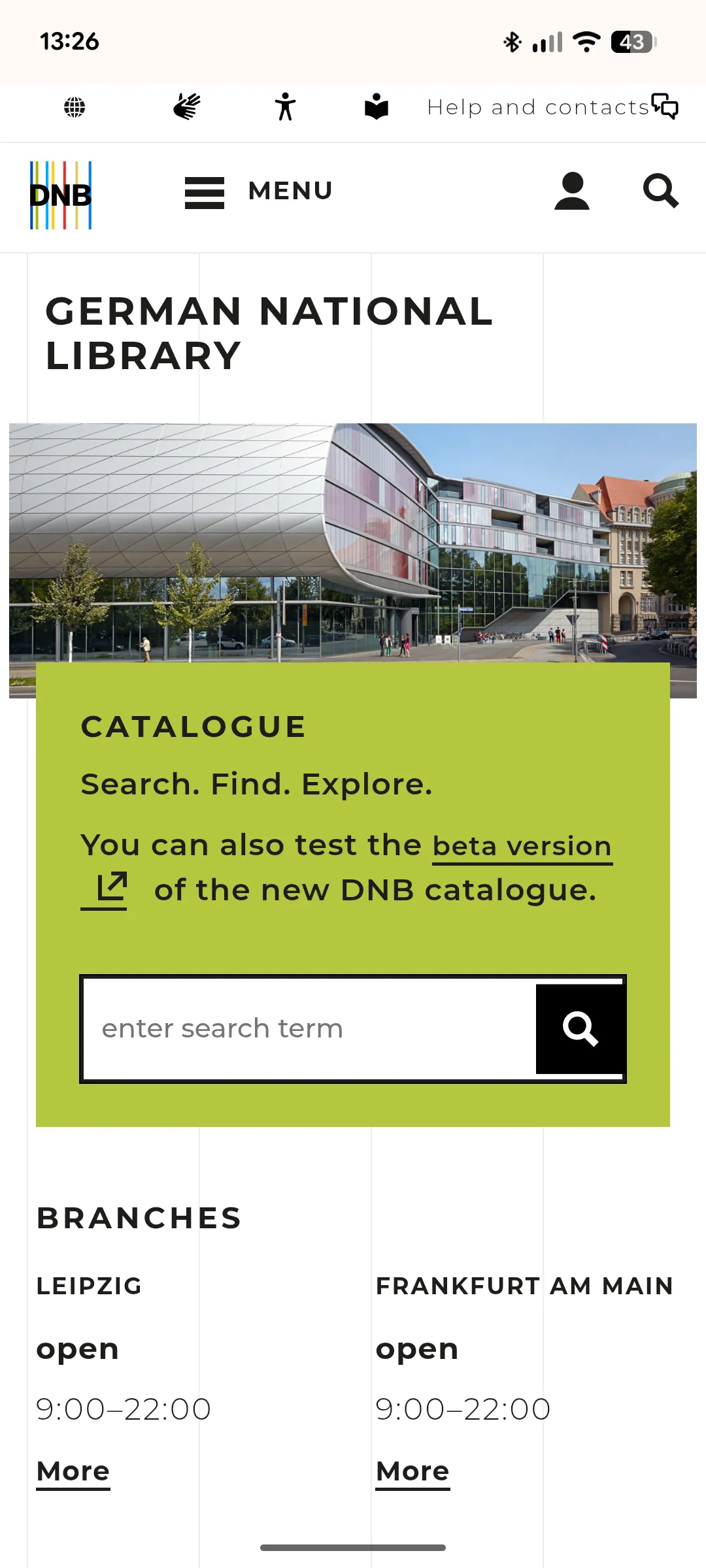
DNB Homepage
Key observations:
Navigation: Simple, consistent menus with clear hierarchy and language options.
Visual design: White backgrounds, rounded corners, a single accent colour, and strong contrast for readability.
Layout: One clear call to action per section and evenly spaced cards for better scanning.
Tone: Friendly, concise copy and accessible labelling.
Insight: Modern library sites use clarity, hierarchy, and strong visual rhythm to support accessibility and trust — principles currently lacking on Göttingen’s site.
These findings guided my redesign priorities for the three key user actions:
* Browsing the homepage
* Searching for/reserving books
* Renewing loans
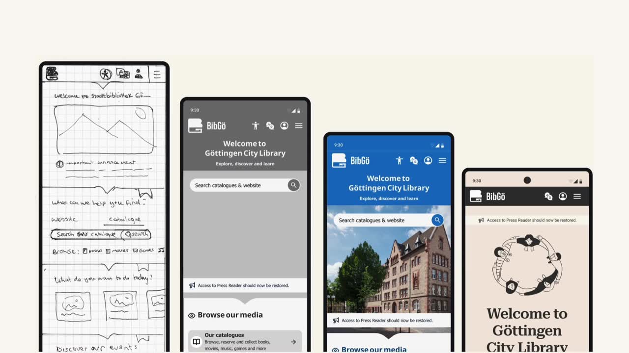
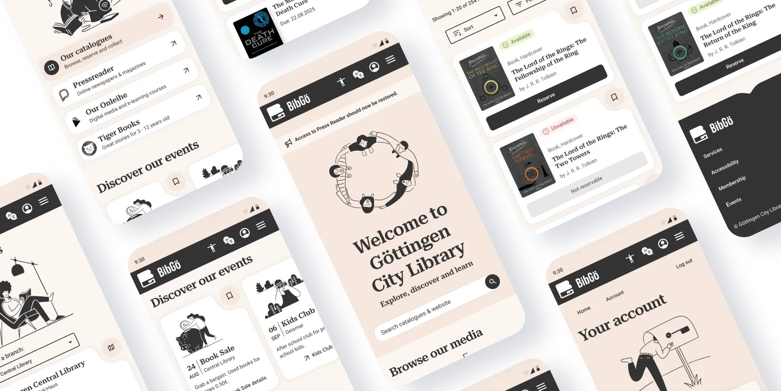
Browsing the homepage
User story 1
As a new resident to Göttingen I want a clear overview straight away of what my local library offers and what's happening right now.
With key user actions, redesign priorities and insights from competitor sites in mind I laid out the order of content I would wireframe for the homepage:
Current homepage
Top menu: Image, long name, slogan, hamburger
Sections: Unclear sections with little hierarchy:
* Log in link
* Welcome banner
* Search bar
* Quick links
* Opening hours
* Digital services
* Social links
* Government site link
* News and announcement
* New books carousel
* More news
* Blog
* Footer
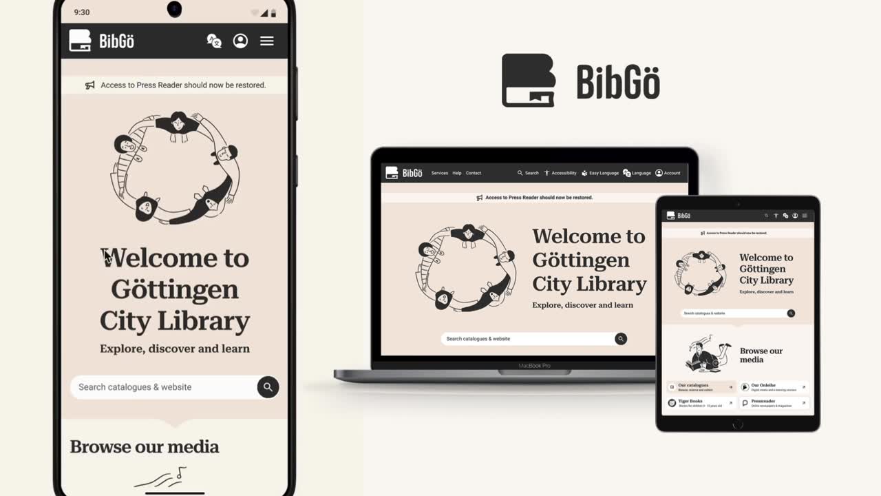
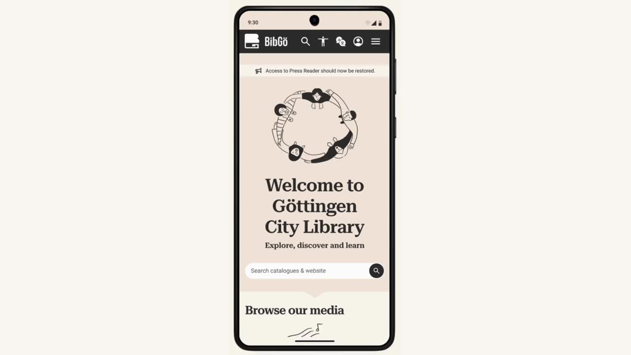
Redesign
Top menu: Logo, short name, icons: search, accessibility, languages, account, hamburger
Hero section: Announcement, image, welcome text, slogan, search bar
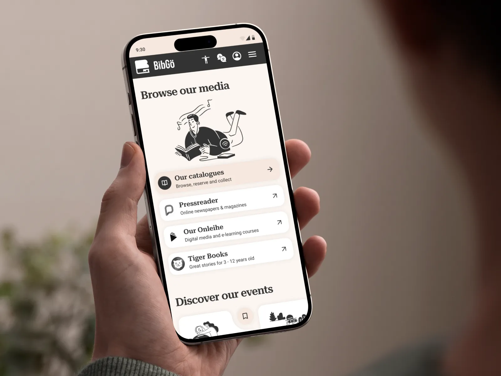
Sections: Clear sections with title, image, minimum content, one call to action:
* Media links
* Events carousel
* News
* Visitor info
* Footer
Changing design direction
I initially wireframed using the original blue-and-white civic palette. During mid-fidelity prototyping, I realised I was playing it too safe—the cold, institutional feel wouldn't serve residents for the next decade.
The pivot: Warm minimalist palette with serif headings to create a literary, welcoming feel. This introduced risk (stakeholders might reject it as "alienating older users"), but testing with mentors and informal user feedback validated the direction.
Agile methodology in action: Rather than perfecting the wrong direction, I caught this early through rapid prototyping and critique cycles — a benefit of lean UX when time is limited.
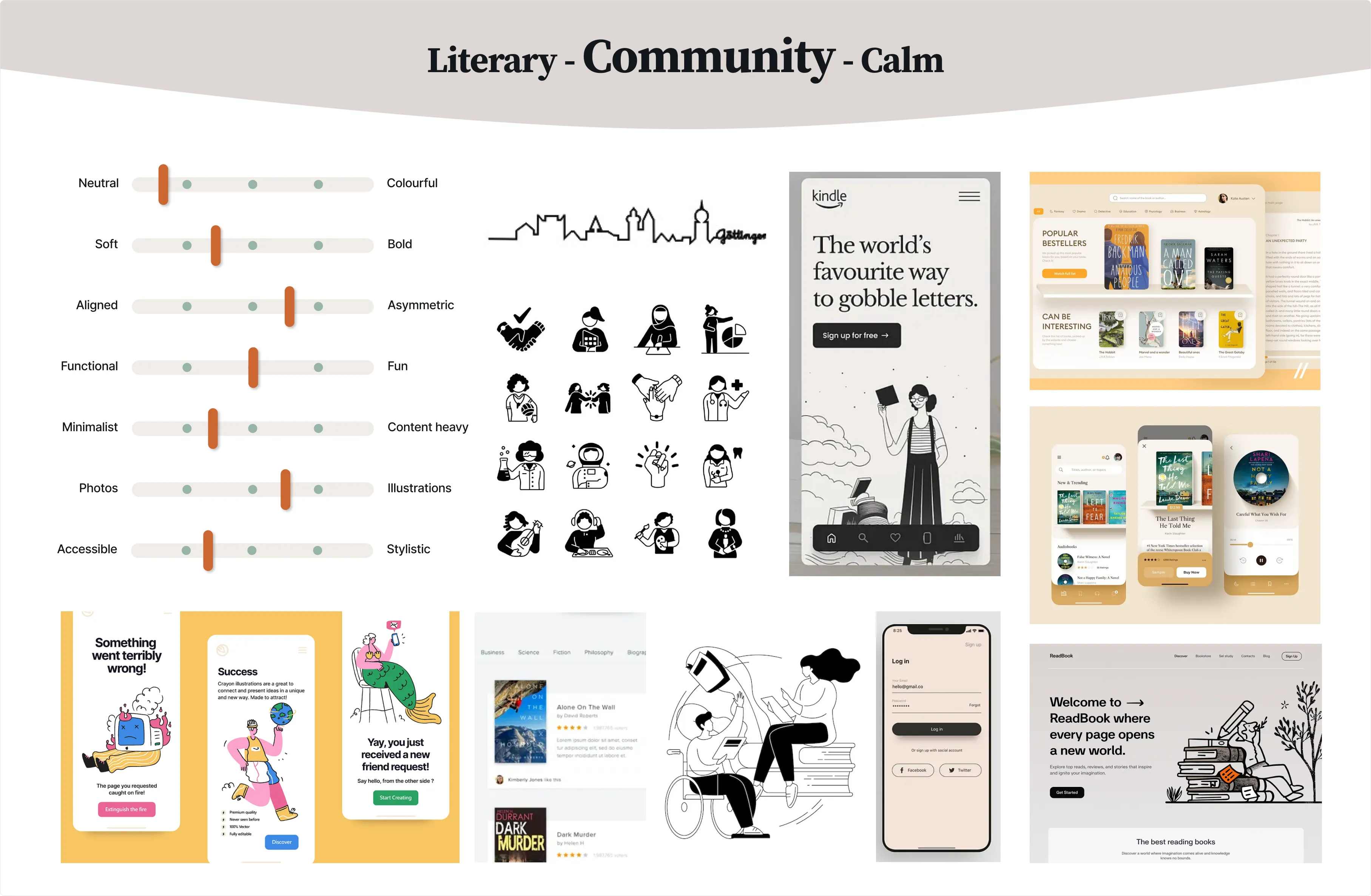
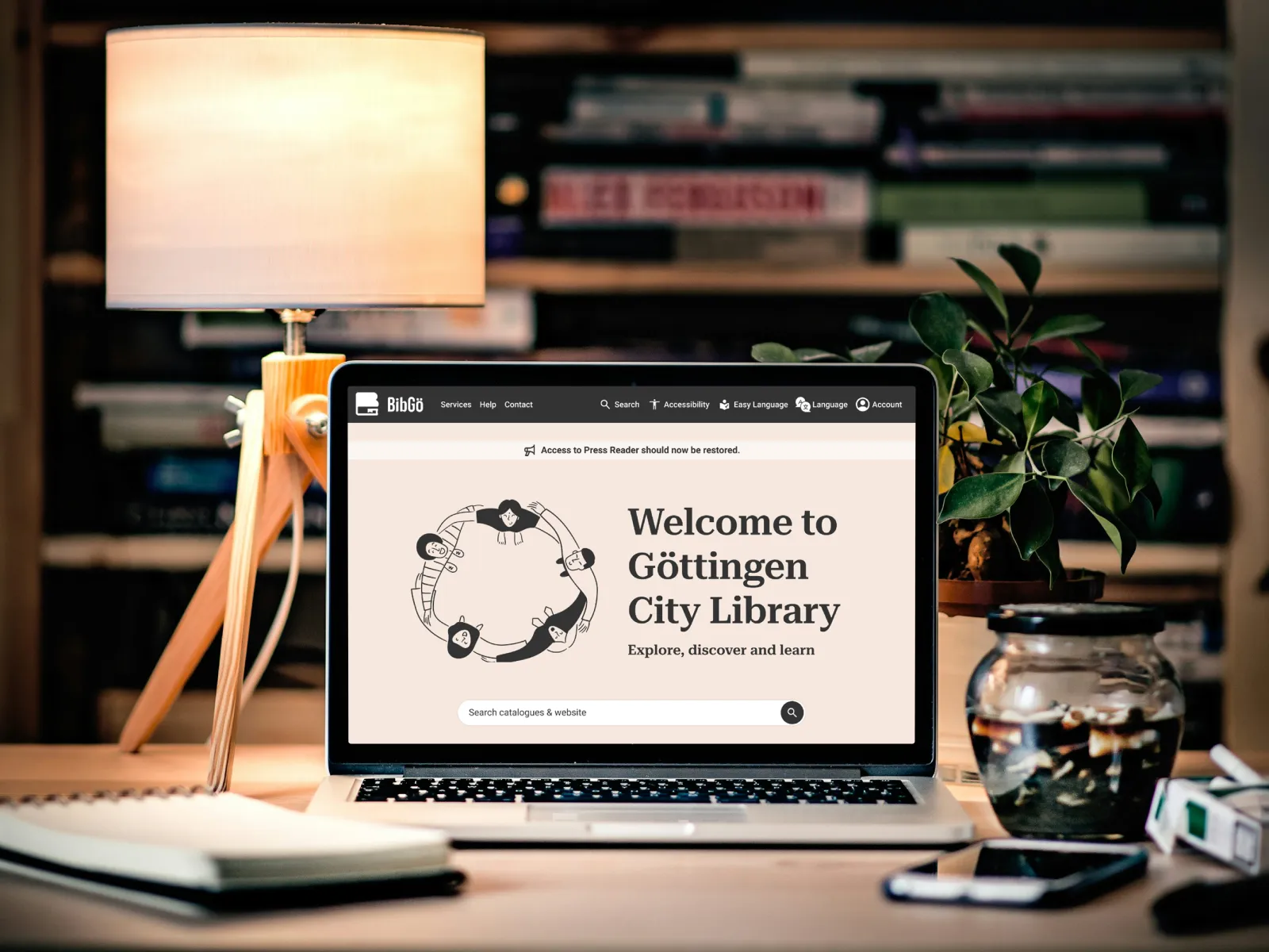
Visually more welcoming
The new design uses a warm minimalist colour palette and serif heading font to give a familiar and welcoming literary vibe that's easy on the eyes. The inclusive, playful images called Brooklyn by Streamline are simple, consistent and affordable to swap from a library of illustrations.
A shorter name & logo to match
BibGö is short for Bibliothek Göttingen following the trend from other libraries to find a short form of their name to better fit small interfaces like mobile e.g. M-Bib (Muenchner-stadtbibliothek)
The logo mark features a representation of a book in the shape of a B with the lower part containing a bookmark helping to form a G (BG - BibGö).
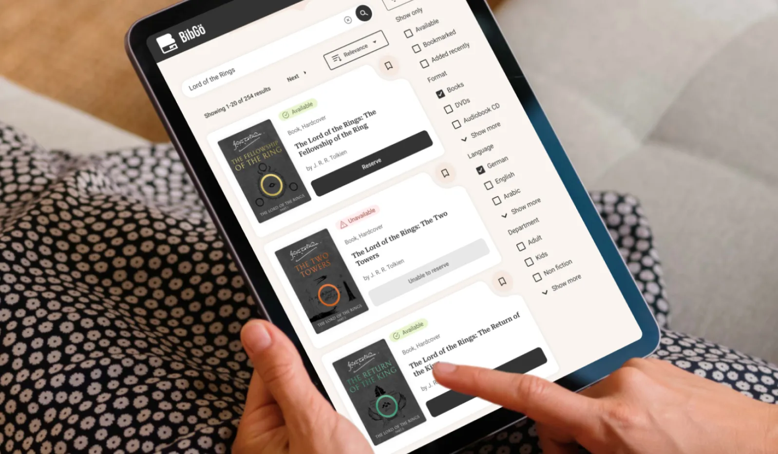
Searching for a book
User story 2
As a frequent reader, I want to search for and reserve books quickly from my phone, so I can collect them later without browsing stacks of books.
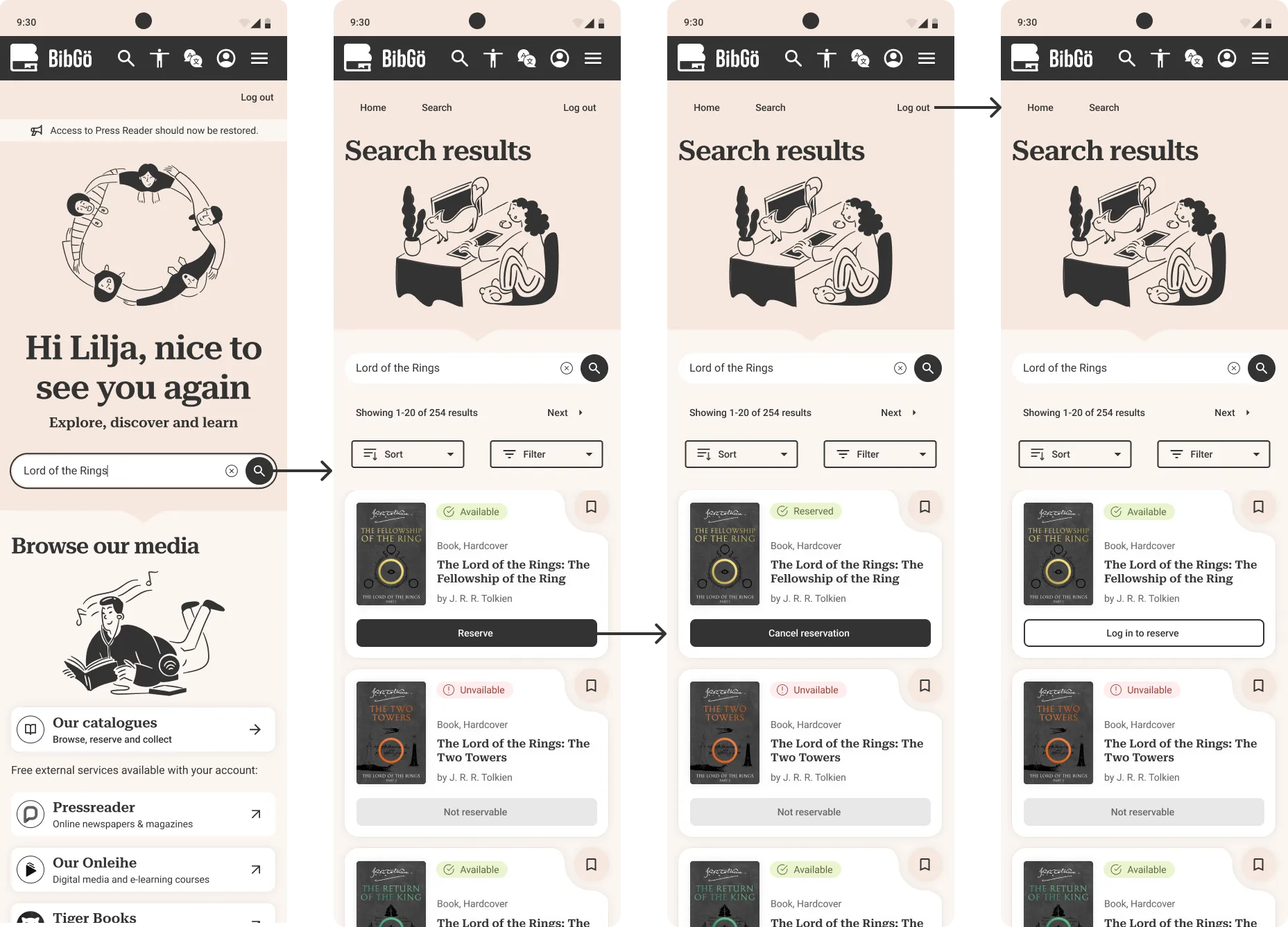
Problem → Solution
Search bar:
Basic functionality, many tab clicks to reach, dated icon → added "clear text" icon, prompt text, top menu bar link and high contrast CTA button.
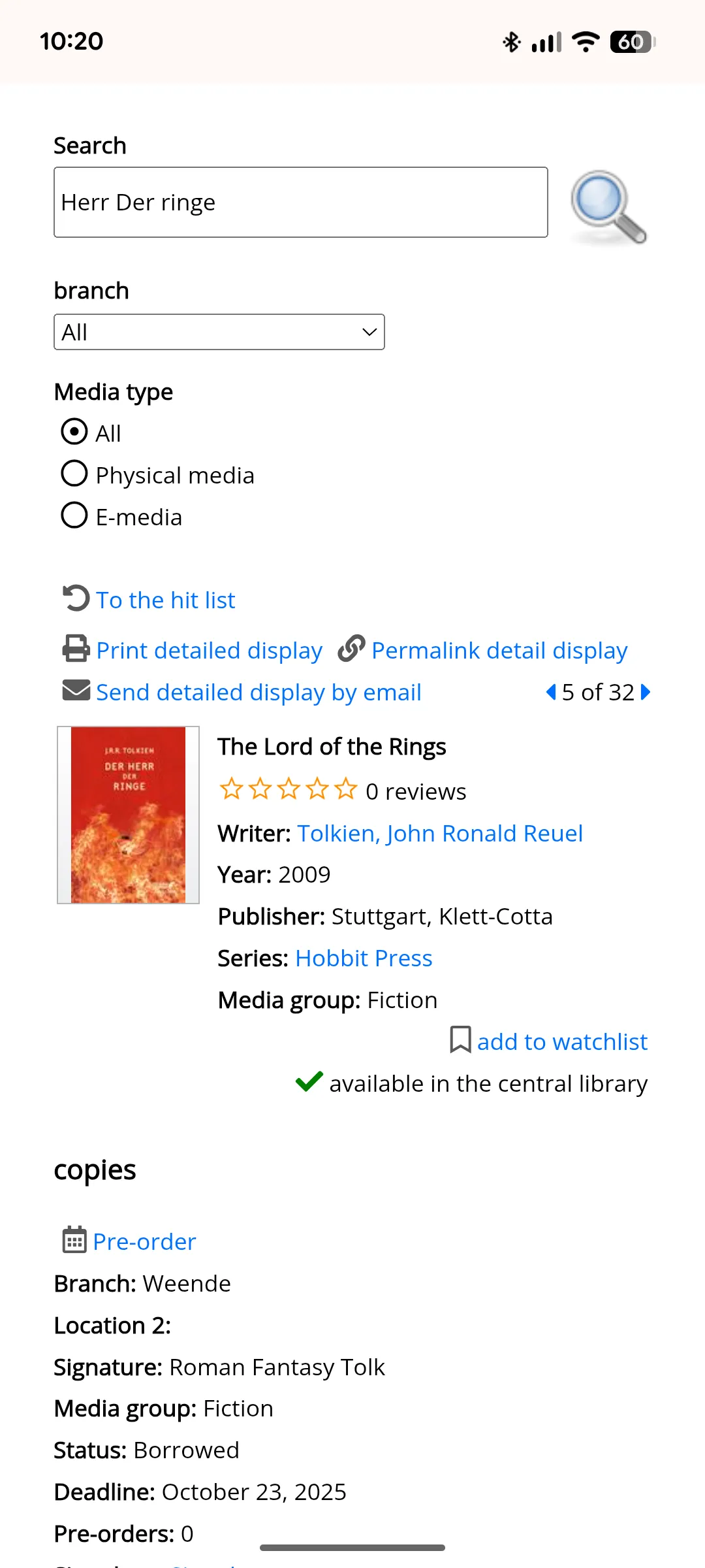
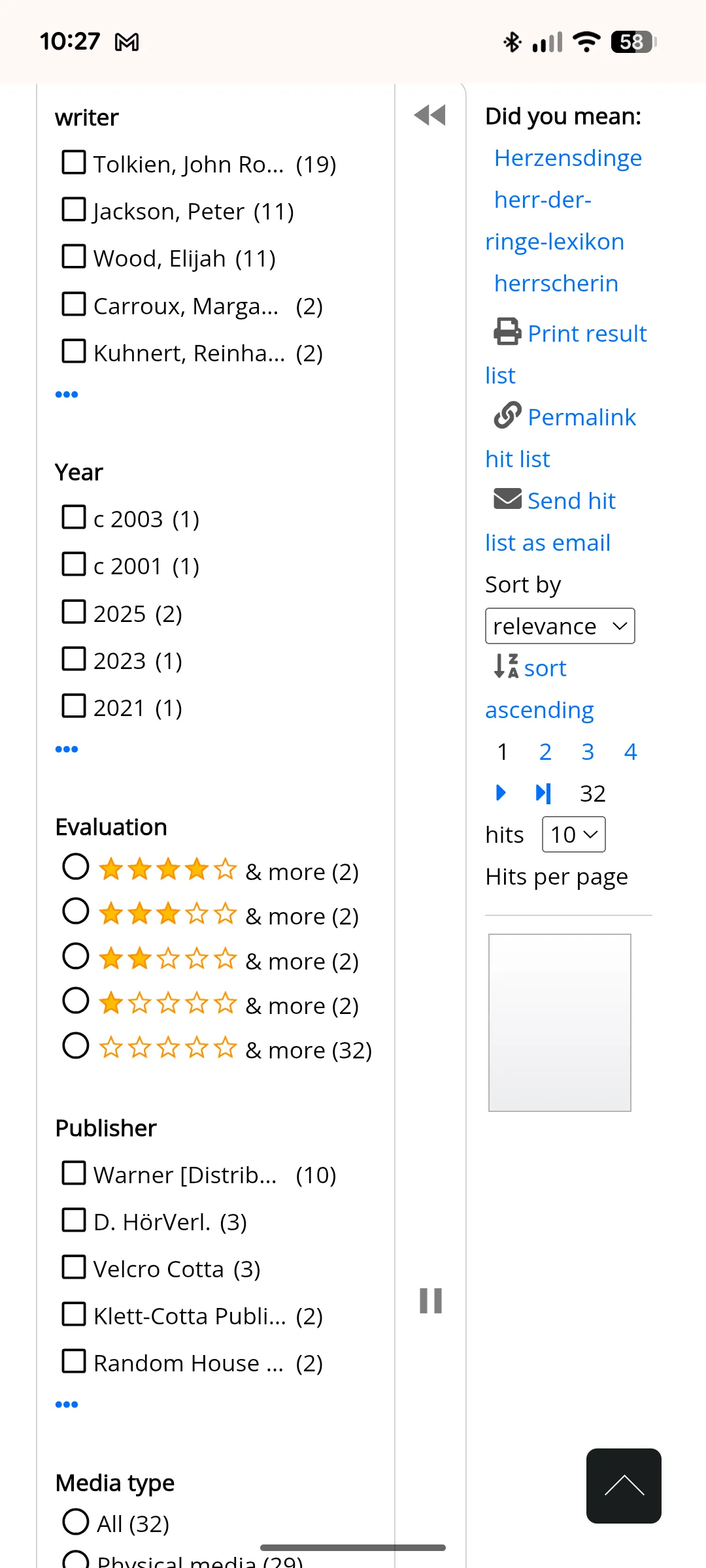
Search page:
Key actions of bookmark and reserve hidden in the noise of text links and unneeded info like publisher, filter options unclear, sort options take up too much space → improved hierarchy and discoverability of CTAs, availability info and search info, created prominent filter and sort buttons (filter panel on larger breakpoints).
Trade-offs:
I went hard on removing details to reduce noise; a final website may require additions or a "Staff" version behind a log-in.
Renewing a loan
User story 3
As a busy parent, I want to extend my child's book loans online and not miss renewal deadlines.
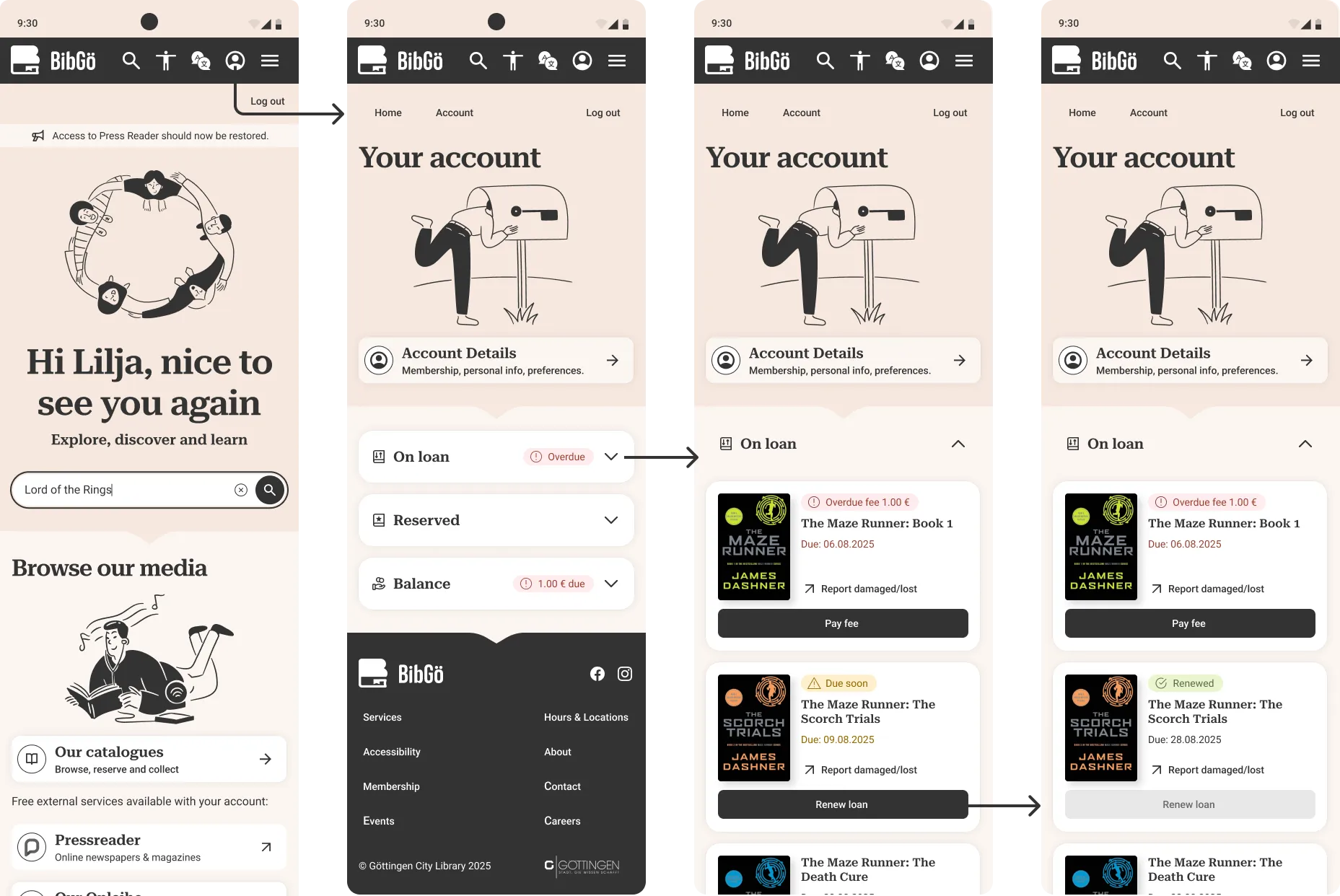
Problem → Solution
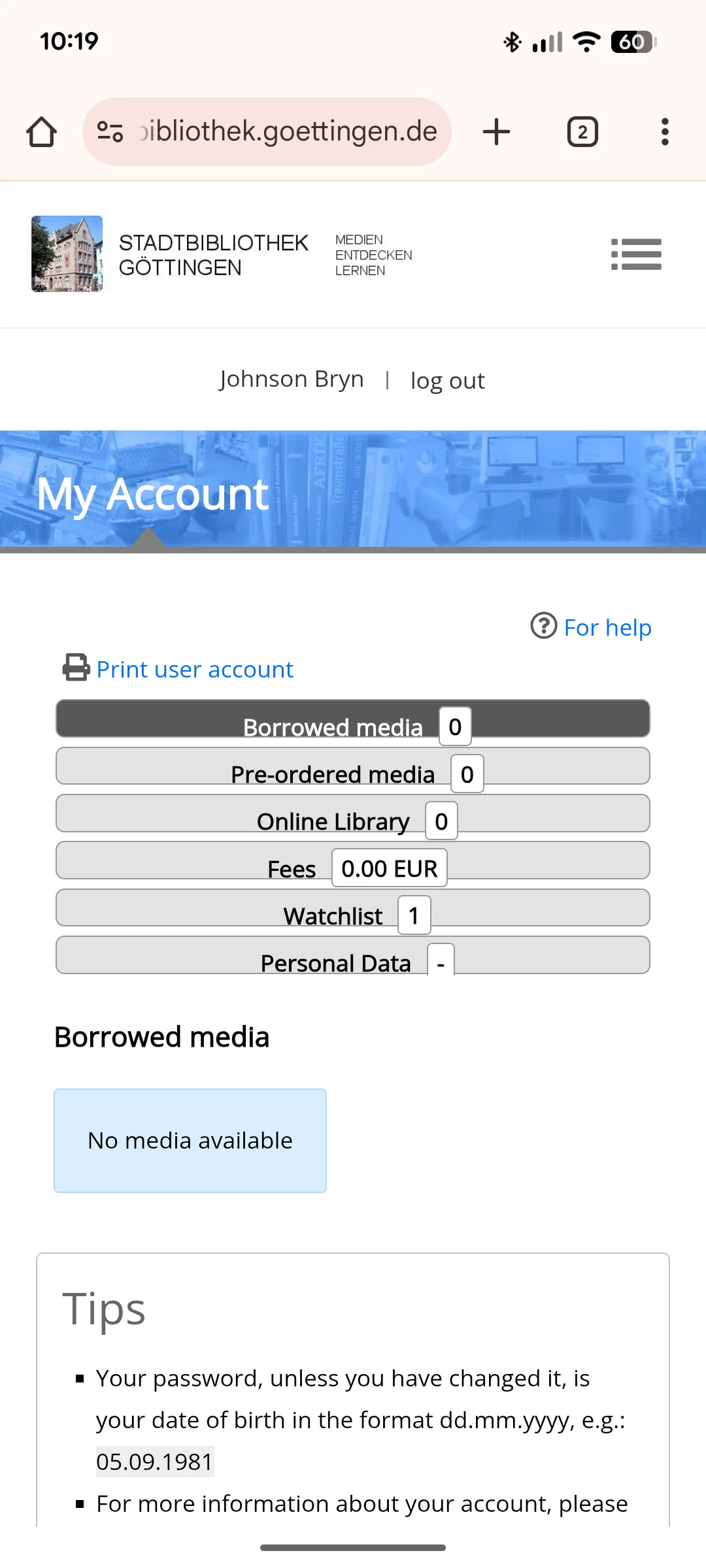
Tags:
Vague tags like "3 items" created ambiguity and required extra taps to understand account status → Created clear scannable tags tags with icons.
Sizing & hierarchy:
Small touch targets and a lack of clear hierarchy failed accessibility standards → Larger touch targets (48px) and improved visual hierarchy make the interface accessible and easier to navigate.
Information overload:
The original design cluttered the interface with excessive metadata for each book, overwhelming the user. → Simplified the item view to show only essential information, reducing cognitive load and improving scannability.
Prototype runthrough
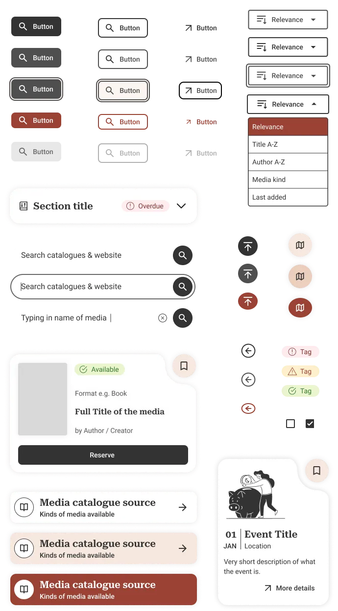
Design system
The warm minimalist colour pallet provides a high contrast black CTA whether filled primary, outlined secondary or just text for tertiary. Micro-animations are seldom to not distract and add to noise, but add a momentary colour and playfulness.
Try below:
WCAG 2.1 AA standard
Although WCAG 2.1 AA is the current legal standard, 2.2 AA is what I reached for with this design including touch targets, contrast ratios, keyboard and screen reader control etc. Did anything miss the mark? Let me know, I'm always learning and love discussing these kind of issues.
UI kit
Reflection
Key takeaways
1. Accessibility constraints improve design for everyone: WCAG compliance isn't a checklist—it's a framework that forces you to consider edge cases, which often benefits mainstream users.
2. Lean UX works when you use what exists: I didn't need 50 user interviews—analysing existing feedback, site analytics, and rapid iteration got me 80% of the way there.
3. Design is about trade-offs: Every decision has a cost. Larger touch targets take more space. Fewer details mean more clicks. Good design is choosing the right trade-offs for your users' actual needs.
4. Ship imperfect, then iterate: The original site is legally non-compliant and frustrating. A good-enough redesign that ships is better than a perfect one that doesn't.
What I'd do differently
Limited user research: With only 2 months and no budget, I relied on existing feedback and heuristics. Ideally, I'd conduct usability testing with a wide range of audiences including sessions with screen reader and keyboard users.
Content strategy: I redesigned layout without addressing content—real-world implementation would need content design collaboration to simplify language and structure, and consider more edge case uses.
