
Accessibility & Usability Review
Process behind two SUB Göttingen web app reviews
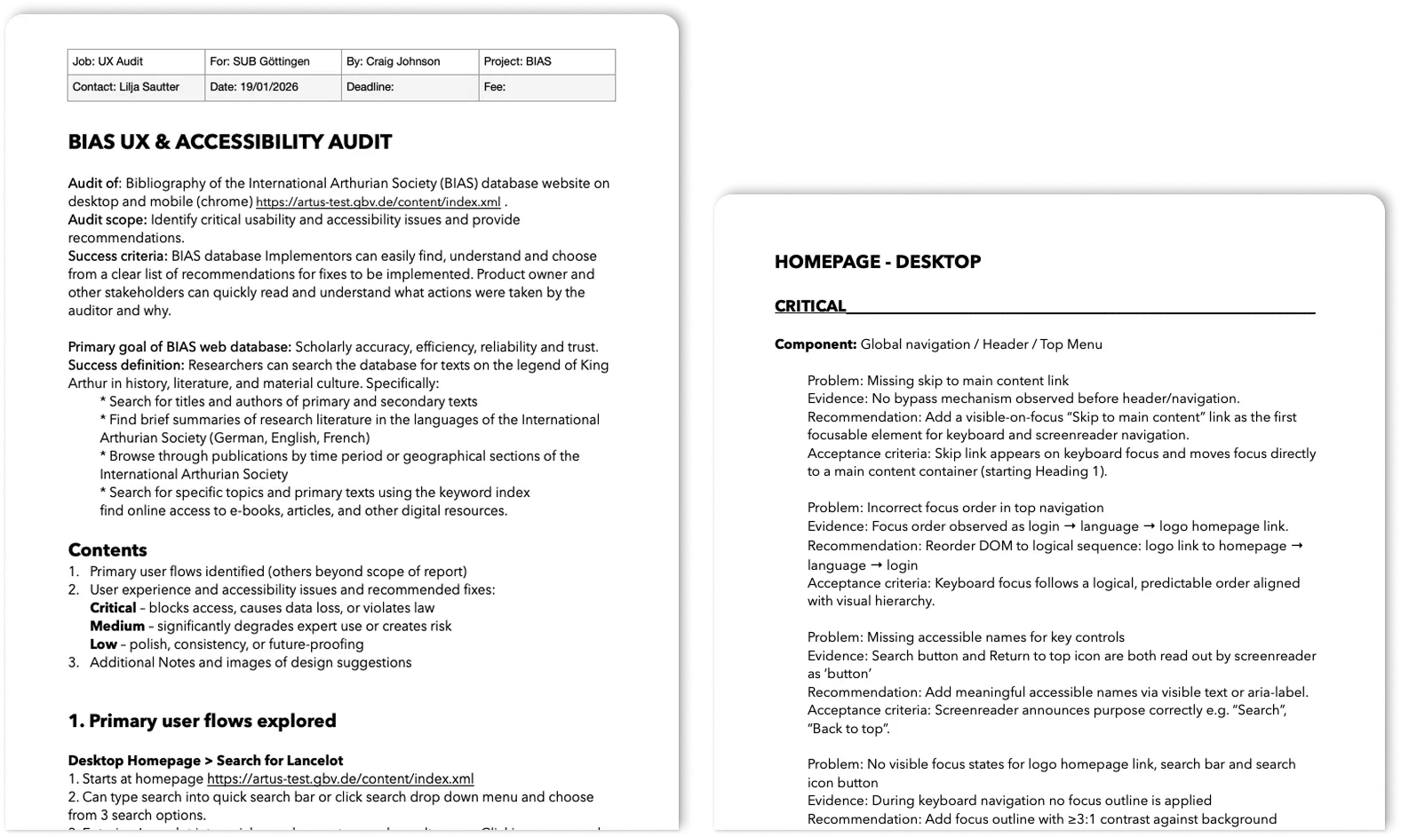
Target Audience: Developers, product owners and project managers at SUB Göttingen
Responsibility
Project meetings, usability analysis, accessibility analysis (WCAG 2.1 AA), audit reporting and UX design
Tools Used
Figma, WAVE, Chat GPT, Affinity Design, Pages, Google Chrome dev tools, Silktide chrome extension
Project Links
TIDO Text Viewer and the beta version of the Internationale Artusgesellschaft website

Problem, Scope & Approach
The problem
SUB Göttingen’s digital texts open source platforms (IAG database and TIDO text viewer) support academic research but presented usability and accessibility barriers that risked:
- * excluding users with impairments and functional needs (WCAG 2.1 AA)
- * reducing search efficiency and task completion (UX/usability)
- * increasing support and training costs at a later date (project management)
Scope & constraints
To keep the review the work fast, cost‑effective, and actionable for development-focused teams who primarily use Agile SCRUM workflows without UX or design teams the review included:
- * Primary user flows
- * Prioritised list of issues with brief recommendations
- * No implementation or visual redesign
My Approach
For both reviews I took a similar approach, which started with a sit down meeting with the Product Owner, to get some context on the project, what state they are at, what is the key goal of the website etc.
The review was conducted using both automatic and manual checking and navigated using mouse, keyboard and a screen reader. The reports were written to be easy to read and comprehendible by all stakeholders and developers. This included:
- * Merging usability and accessibility issues together as they produce overlapping issues
- * Task‑based review focused on primary user flows
- * Issues grouped by component and priority and formatted as Problem → evidence → recommendation → acceptance criteria to reduce developer handover friction
Top 3 Findings
1. Discoverability & Efficiency
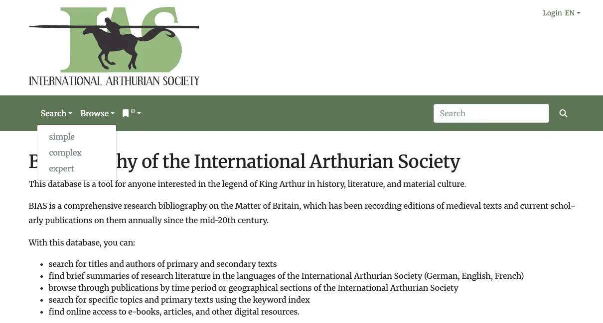
Common issues when looking at the primary user flows:
- Core search functions hidden, deprioritised or overly complex leading to excessive clicks or tabbing for common tasks
- Including too much information and unsuitable naming leading to confusion, uncertainty and overwhelm
- No clear hierarchy revealed by the UI design leading to longer time on task
2. Accessibility Barriers
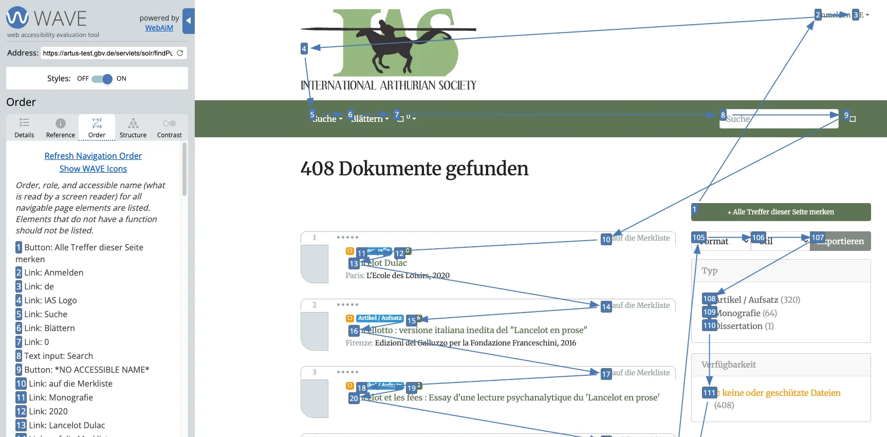
Common issues with accessibility according to WCAG 2.1 AA (legal minimum) and some additions from newer standards:
- Missing skip to main content links and landmark regions (Bypass Blocks)
- Inconsistent or missing focus states - 3:1 and 2px under WCAG 2.2 AAA
- Repeated contrast failures - text 4.5:1 and interactive UI elements 3:1
- Non‑descriptive links and controls - link purpose in context and accessible naming
- Inaccurate reading order - meaningful sequence/focus order
- Information inaccessible via keyboard control - keyboard operable
3. Component Design Issues

Common issues when looking at overall styling over UI and its components was a lack of design system:
- Inconsistent styling of buttons without a clear primary, secondary or tertiary function
- Too much colour used or overuse of a low contrast primary colour
- Components too cramped or close together
Next Steps
Ongoing implementation
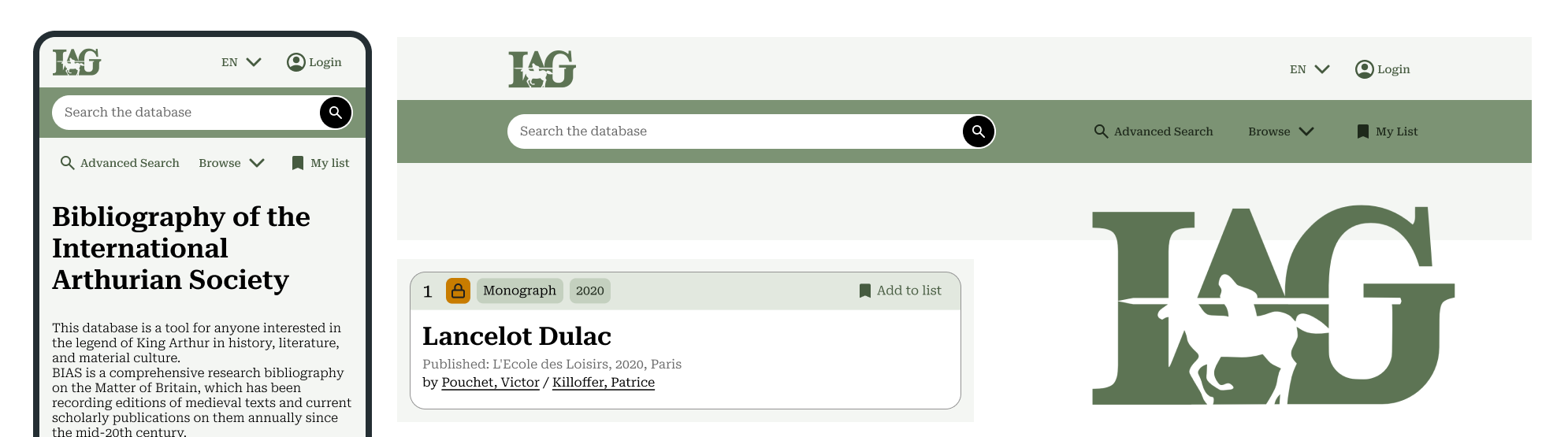
Above are some design suggestions included in the audit report for the beta version of the IAG website.
Both projects are ongoing, however developers have started implementing changes in the German version of the IAG site. I will update this case study with developements when available.